A simplified CTA
At Contrast Security, I led UX writing company-wide. Alongside my UX, Product, and Engineering partners, I designed experiences that help users secure their code. I wrote labels, descriptions, and guides across three products, a platform, and many integrations.
The following case study explains a call to action mock-up for a product called Protect.
Problem: Too much real estate
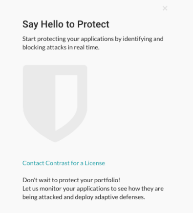
This CTA to purchase Protect was located as an empty state in another product. Its purpose was to lead the user to more information about Protect and to the licensing page.
Problem #1: It was too large.
Problem #2: It had too many words.
Problem #3: It had disjointed messaging.

Approach: Collaborate to simplify
By working with my Product partners, I was able to simplify the text, the layout, and the CTAs. They helped me understand the intent of the empty state and the goal of the messaging.
I also worked with UX partners to discuss the specifications and the impact to the interface.
Impact: The new design was much smaller than the original and required a rework of all of the empty states throughout the platform.

Methods: UX writing principles
I worked with UX writing principles to define the parameters of the message and to edit the content.
Concise and clear: Edited down the language to the most important and basic parts.
Prioritized: Prioritized the most important and impactful message.
Voice and tone: Made sure to adhere to voice and tone guidelines. Evolved guidelines, if needed.
Plain language: Used language that is easy to read and understand.
Outcome: Multiple iterations
Iteration 1

Iteration 2

Iteration 3
